3 min read
It may sound unlikely at first but there's plenty we can learn from airports about website design.
But how can that be when the two are so different?
Well, our brains actually follow very similar processes to navigate both.
Shall we take a trip?
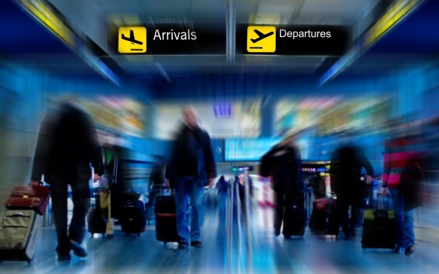
Think about what happens when you arrive at the airport.
There are a small number of things you want to do.
You want to check-in, pass through security, get to the departure lounge and board your flight.
With a website you often arrive wanting to browse, learn a bit about the company and product or service then find the enquiry form and send a message.
In both cases it's a handful of steps to complete your task.
Every visitor is different
Think about the people you see at an airport.
Often they're from different parts of the world, and a wide range of ages, nationalities and backgrounds.
Yet airports are designed to be accessible and easy-to-use for everybody.
So how do they achieve this?
Simple language
First, wording on signage is reduced to its simplest form.
The fewest possible number of words appear on every sign, and the simplest words are used.
Airport signs say "Departures" not "This way for departures".
So you understand what they say in a split-second.
They use sans-serif typefaces and mixed cases so your eye can recognise the shape of the words without having to process the letters.
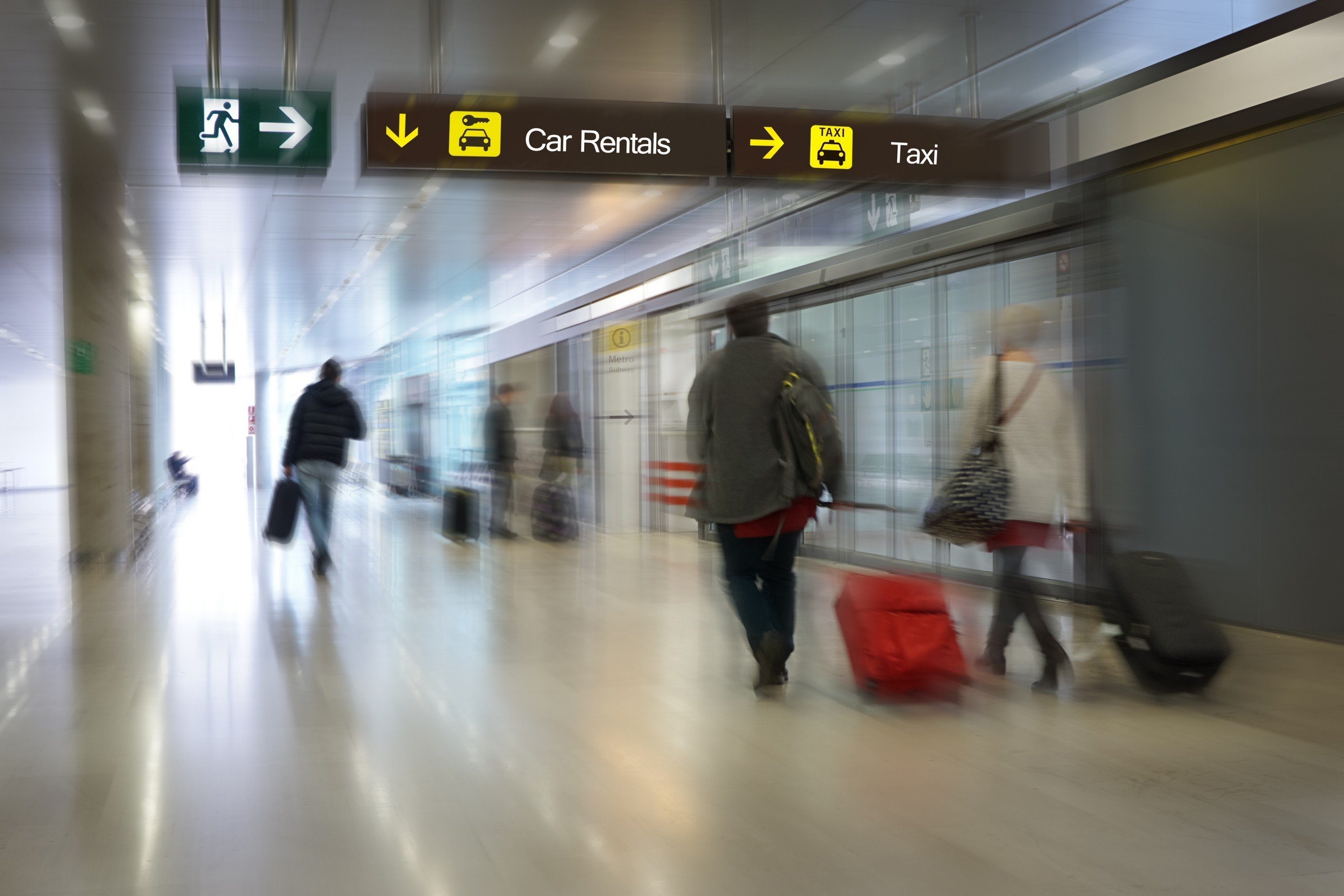
Consistent design
Second, in an airport you actually see hundreds of images and words.
People constantly move around, you see the runways out of the window, shop fronts, offers, advertisements.
Yet your brain can quickly filter so it sees only the signage.
That's because it's so bold and consistent right the way through the airport.
If it's an information sign it's yellow, always uses the same style of language, symbols and the same size type.

Is your website this easy to navigate?
Your website is also used by people with a variety of backgrounds and browsing habits.
One of the few things its visitors have in common is they are normally in a hurry just like the people in the airport.
Does your website help visitors by using the shortest and simplest wording?
Does it use words the eye can scan the shape of rather than having to read?
Are your menu options, headings and calls-to-action consistent so it's easy to filter them at a glance and jump to the next stage in the process?
If you squint and look at your website it should be obvious what it’s inviting you to do next - just as it is if you glance around for a few seconds around in an airport.
Think destination
Next time you're at the airport notice how directional the building is.
It constantly tells you the next step to get to the end.
When passengers enter an airport 100% make it to their flight by following super-simple signs.
On a typical website fewer than 10% of people make it through all the steps to the end.
It’s always possible to improve that conversion rate percentage with better website design.
How much better would your website perform if it directed visitors as clearly and simply as airports do?
Here to advise with your new website design, marketing strategy or campaign ideas.


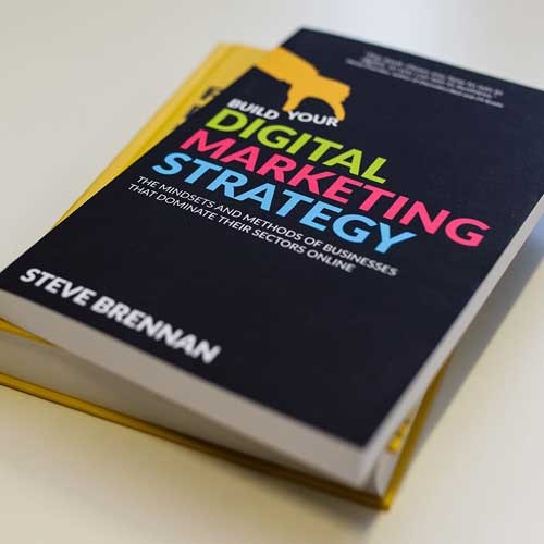
Steve Brennan is Co-founder and CEO of Bespoke, and author of the Amazon #1 bestseller, Build Your Digital Marketing Strategy
Get the book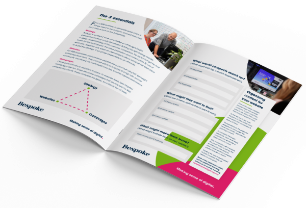
Free download


accredited agency

41 sec
If you're looking for any of the following, we could be well-matched:

The website looks and feels excellent. We asked for wow factor and got that.
Anthony Formosa
Harrington Boyd

We get clients from further afield now who say they are finding us through Google.
Lisa Kennery
Pierce Accountants

We’ve been on a transformation journey with the brand and the website now reflects that.
Sarah Cooper
Strongdor

Bespoke understand how to turn web traffic into leads.
Adam Livermore
Begbies Traynor Group

The new site is worlds apart from the old one, it’s a brilliant shop window for us.
Clare Wilby
Commercial Manager, Clifton Trade Bathrooms
With regards to value for money the service from Bespoke has been very good.
Emma Curtis
Head of Marketing Plumbs